Colour of the Year 2022
With all the array of colours out there for us to be inspired and influenced by, having the ultimate authority in colour, Pantone decide for us which will be THE colour to inspire us every year can be a helpful guide..
So drumroll..the colour of 2022 according to the powers that be is….
Very Peri, aka Periwinkle Blue.
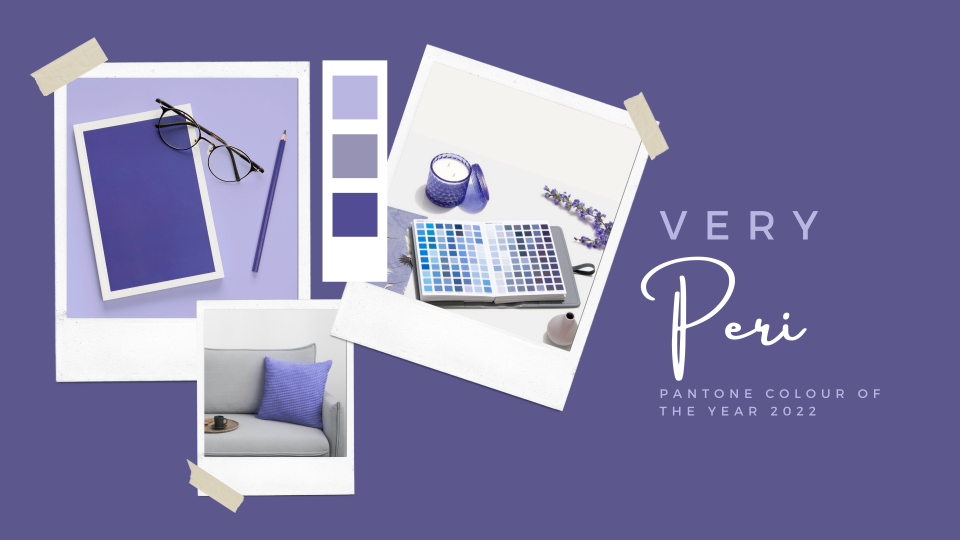
Pantone Colour of the Year
Described by Pantone as a 'dynamic periwinkle blue hue with a vivifying violet red undertone'. It is inquisitive and intriguing with a carefree confidence. A reflection of the current mood as we start to embrace new possibilities and optimism living our lives in a post-Covid world. A colour that for the first time in their Colour of the Year forecasting is a brand new creation, it is set to liven up interiors for the year ahead. Here are a few ways to bring ‘Very Peri’ into your home this year.
Accessories
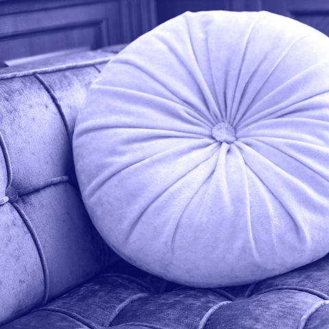
An easy win. Update your cushions, throws and your ornaments. This colour is perfect as a Spring update for your home. If a room scheme is quite neutral to minimise the jarring nature of having one bold colour on a backdrop of whites and creams look for patterned fabrics for cushions mixing the Periwinkle blue with these soft tones. Bring in texture - look for cushions that maybe have tassels in the blue, or even a piped trim for a subtle nod to the trend. An accent chair in this gorgeous hue would be a real focal point for any room.
.png)
Artwork
Updating and rotating your artwork can be almost as effective as a complete redecoration in regard to changing the mood of a room scheme. Changing the configuration or location of statement pieces alters the focus, creating an opportunity to update the layout or flow of the room. Look for abstract more contemporary canvas paintings for bright and airy modern spaces, a dark frame will contain the artwork and make it stand out more against any backdrop. For a subtler look go for white or light wood frame, maybe even consider matching to other already existing finishes. Classic landscapes, or still life paintings suit most styles of decor and can act as a vehicle to bring subtle colour into your home
Be Brave
If you are thinking of redecorating and the subtle approach is not your thing then going all in and painting your walls in this bright and vibrant shade is certainly a way to make a statement. Be sure to plan your scheme, see how you can balance the intensity with other tones to prevent overwhelm and the colour dominating your furniture.
.png)
- 8th February 2022